

-
I led Kimberly-Clark’s transition to Figma and rebuilt their design system from scratch, making components cleaner, easier to find, and more organized. By improving naming conventions and implementing auto-layout and variants, adoption of the system increased significantly.
To solve their major scalability problem (as they own many brands), I created a reusable “vanilla” template, based on the corporate design system, as well as a training program for new designers. This allowed teams to set up a nearly complete brand-specific system in 20 minutes; a process that used to take 6–7 months.
In the end, we successfully migrated all designers to Figma, modernized the design system, created a scalable template for future brands and boosted overall adoption.
The creation of a Kimberly-Clark corporate design system had been started by an agency but had not addressed designer and developer needs and was incomplete. Our objective was to streamline the process of building top-quality design systems for multiple brands and to foster greater adoption and usage across the organization.
An adoption and scalability problem
After auditing the current system and performing interviews with designers, developers, and stakeholders, we discovered the following issues:
Extremely low adoption of the system.
Poor naming conventions and unneeded layers were making components difficult to find and use.
Developers were unaware of the system or how they could access it.
Windows-based designers and developers could not access Sketch.
Rampant branding inconsistencies.
Lack of guidelines made designers unsure of how to use components.
Lack of a single source of truth by having components across Sketch, Invision, and Invision DSM.
Building from scratch
Following our preliminary research, we concluded that the first step would be to simplify our assets and move them to Figma. By starting from scratch, we were provided with the opportunity to overhaul the entire system, guaranteeing consistency across all components, and modernizing the branding. To achieve these objectives, we performed the following studies:
Benchmarking study: examined small to large company design systems—such as Google, IBM, Uber, Atlassian, REI, Audi, Adobe, and Mailchimp—to get an understanding of how we could best approach ours for our needs.
Card sort study: this study helped ensure category names were intuitive to our designers.
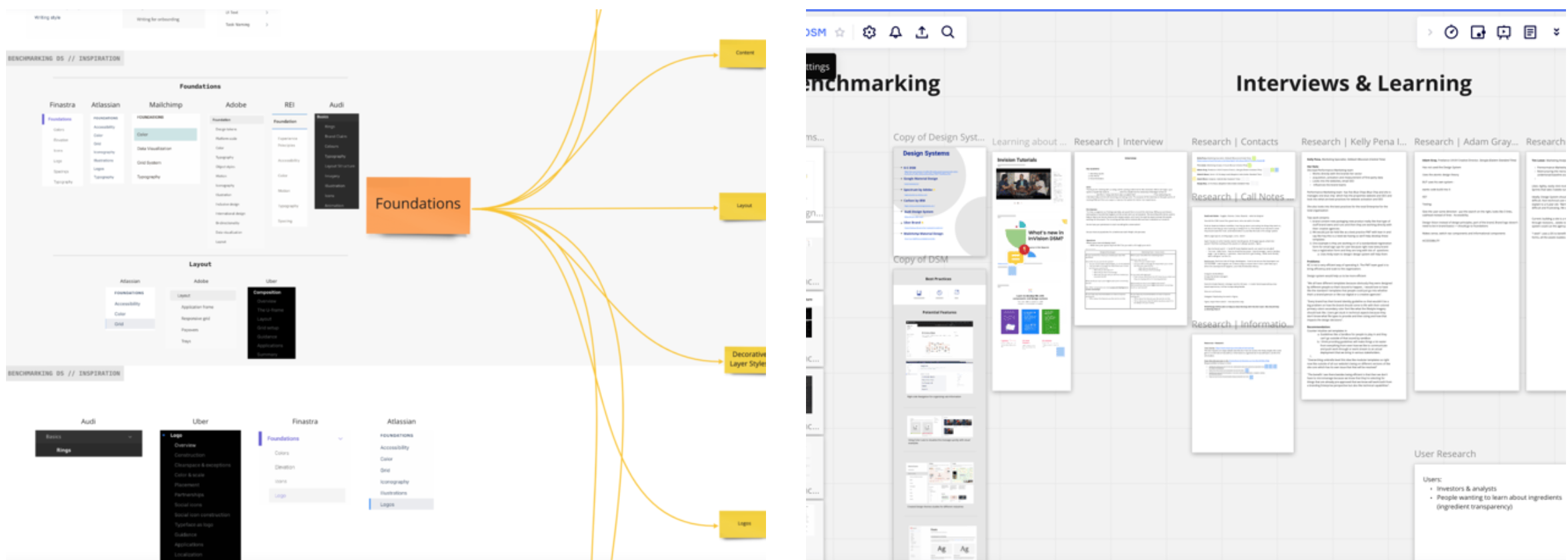
Capturing research and reviewing system architecture in Miro
Moving to Figma
We decommissioned our enterprise plans for Sketch, Invision, and Invision DSM and transitioned to Figma. We showed designers and stakeholders how a centralized system could increase adoption, lower development costs, and help us maintain a stronger brand. Of course, a strong motivator was the overall cost savings of moving to Figma (approximately 83% in cost savings).
Updated component library and guidelines
All components were created with the following tools and standards in mind:
Auto Layout: this helped us cut down on layers, increase responsiveness and scalability, and have a more common language with our developers.
Variants: components were combined into variants to help with findability.
New icon set: we chose to switch to Bootstrap’s open-source icon set to complement the brand and offer consistency across all icons.
Accessibility standards: colors were shifted to comply with WCAG AA criteria as well as ensure colors could be distinguishable for colorblind users and never used alone to convey meaning. Readability was also improved by increasing font sizes and ensuring line length was appropriate.
User Experience improvements: of course, we ensured each component followed best practices.
Mobile-first approach: we used this approach when building components as it helped us simplify and ensure components were responsive.
Do’s and Don’ts: applicable components were given specs and guidelines to aid designers and developers, including visual examples of correct and incorrect usage.
Results
Figma was heavily adopted by designers and developers who immediately saw the benefits of having a single source of truth for components, branding, and guidelines. The new system enabled them to construct a full page in less than 5 minutes, greatly enhancing efficiency and productivity.
We also redesigned the Kimberly-Clark website with flexible, responsive, and modern layouts along with our new components that fit the brand better. These changes have yet to be implemented as the K-C site is not a priority, but we still were very proud of this redesign and look forward to seeing it implemented in the future.
Scaling our success and next steps
Making a design system template
A problem still knocking at our door was scalability. Since Kimberly-Clark owns multiple brands (around 30), a design system was needed for its most prominent brands. This daunting task was only made possible by creating a design system template based off the corporate brand’s system. We made a “plain/vanilla” template for designers to copy. Then, they simply updated the styles with the brand colors and fonts and have a 98% complete design system ready to use in about 20 minutes (compared to the 4-6 months needed to create a system from scratch)!
Unique brand components would still need to be created but this new process helped designers feel confident in using the basic components while working on new components. We also took into account that future modifications and components would be needed, and we ensured that our organization was flexible enough to allow for such updates.
Next steps
As seen in my portfolio, we redesigned the Huggies (AU) and DryNites (UK and FR) sites while simultaneously delivering their respective design systems. Our developers were able to reference the design system and build updates much faster.
Even after my departure, designers successfully used the template to build design systems for Poise, Kleenex, Depend, and Kotex.